Hey, voice actors. Is your website limp, lifeless or barely there? Does it suffer from lengthy load times, apparent invisibility to Google or other seo struggles that could steer precious potential clients away from your online storefront? Well then, I’d like to direct your attention to a team I have come to consider partners in my success: Joe Davis, Karin Barth and Brian Fulsang of voice actor websites.
When I came across Joe a few years ago, I was in a quasi-desperate state. I had invested a chunk of change in a marketing company that was doing-me-wrong. They demanded a contract, used secretive and sneaky seo practices, remained unaccountable regarding the use of their time (aka my money) and for all that, were ineffective. They were the Snidely Whiplash to my Perils of Pauline….er, Kim.

In swooped my Dudley Do-Right….ok, right, I’m carrying this metaphor too far. In came Joe. First, he gave me more information about how my website operated (or didn’t) in one phone call than I got from the Snidely team in six months. Then, after I finally got the former team to itemize some of the things they accomplished for me, he verified what I had thought. I was being bamboozled with tech talk and railroaded with keep-her-in-the-dark-itis.
This was not what I’d signed up for.
I switched to Joe’s company. I learned that my website itself needed cleaning up, revamping, and solid branding. Its load times were slow and not uniform across devices. My demos weren’t even showing up on mobile phones! As in – completely invisible. And that according to Google’s eyes, other sites (they who shall not be named) were more of an authority on me and my business than my own site was.
Tsk. Tsk.
Where to begin? Initially, I threw my old site up without a solid plan – other than the fact that I wanted blue to predominate and that it should feel soothing or calm when you landed. For my site with the Voice Actor Website team, Joe directed me to Karin, who asked me to fill out a questionnaire and send them links to other sites I liked.
 Then I got to browse color combos. I went a bit nuts with those. They were so beautiful. I pulled out color combos for home renovations and wardrobe choices as well as my new site 🙂 I narrowed it down to three and forwarded them to Brian, my new graphic design guy. Not content with just my questionnaire responses, Brian and I chatted on Skype and he pulled more info from me. Not the best at waiting – it makes my eyeballs itch – I dove into other things and a short while later Brian sent me a mockup of my new site and logo and it was unlike anything I could have envisioned myself.
Pkhoooh. (Sound of old ideas exploding and falling away)
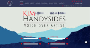
It was beautiful. Mountains and waves and a color pallet, that I picked, but hadn’t envisioned in those combinations. I asked if could add a photo element to the graphic that I liked. He did and saturated it in what were becoming my branding colors. We played around with a few elements and it came together more. I loved the collaborative feel. I had some input, but Brian really knew how to take my input and turn it into something that I love even more, every time I look at it.
 Then came Skype time with Karin. We talked content. She explained that some people would only stay on the home page and scroll up and down and that we should make certain they found everything they needed on that first landing. Then she pointed out that more pages were an asset for anyone who wanted to spend more time on my site. That we should have an About page, so they could get a bit more insight into me, my career & my life in general, a Demo page (in addition to the demos on my home page) where people could listen and download all kinds of stuff in both mp3 and video format, and a Contact page. Other things people like to see? Testimonials from those who you worked with/for, great or recent Clients, and since I blog, a page for that.
I also had other pages I wanted to add. A Coaching page was warranted, this bubbled out over the past few years to include my private coaching, my wildly successful group coaching classes and my read rate workshop. I also wanted a page for the charity work I do. The pro bono VO and so we put together my Giving page.
 Content loaded and coded, at each interval, we Skyped and went through it together. Again, the collaboration was incredible. On my original site (the one I created eons ago) it took forever to get my instructions understood and changes modified. With the Voice Actor Websites team, I always got quick responses and solutions that were better than what I’d originally asked for. Plus, they were super to work with. My new beautiful site went live in less half the time it took the original site to make it out the birth canal and at a cost commensurate with the price of the old one. Since then, they’ve taught me to add and modify pages myself which gives me the benefit of even more collaborative control.
If you’re thinking of updating, branding or rebranding, improving the seo of your site or anything else related to the online marketing of your voice business, I whole-heartedly recommend checking out Joe and his team. They totally rocked my vox!!
A voice over artist for more years than millennials have walked the earth, Kim Handysides is constantly thrilled with her frequently updated voice over website.
